About Me
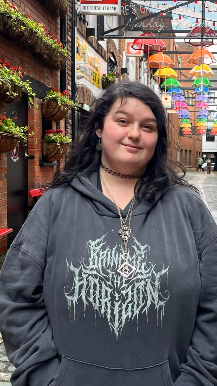
Hi! My name is Bryony and I’m a graphic designer proudly from Wolverhampton. I am a huge fan of metal music and an even bigger nerd when it comes to video games.I have been practicing Graphic Design in education for over 5 years, and I am Adobe Certified Professional in Graphic Design and Illustration Using Adobe Illustrator. I am always striving to make even better work with each project and always trying new ways of experimenting.I studied at University of Portsmouth and I have presented my work at D&AD New Blood Festival.
Email: [email protected]
Portfolio
New Balance 2025
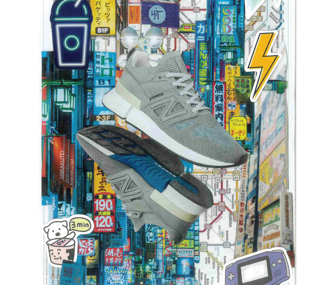
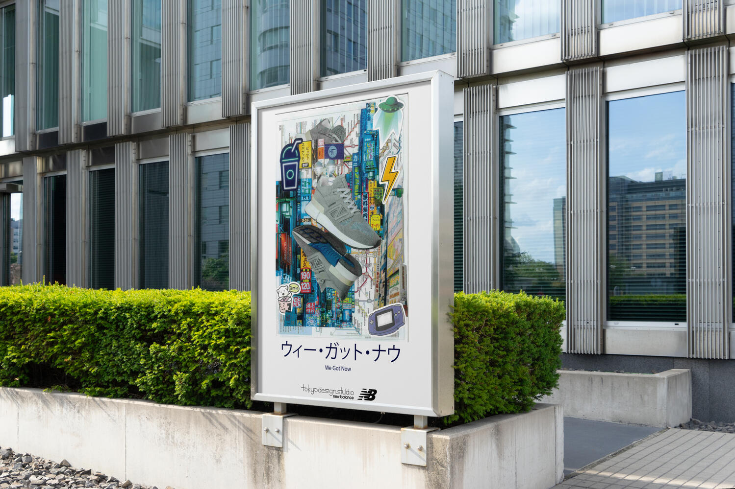
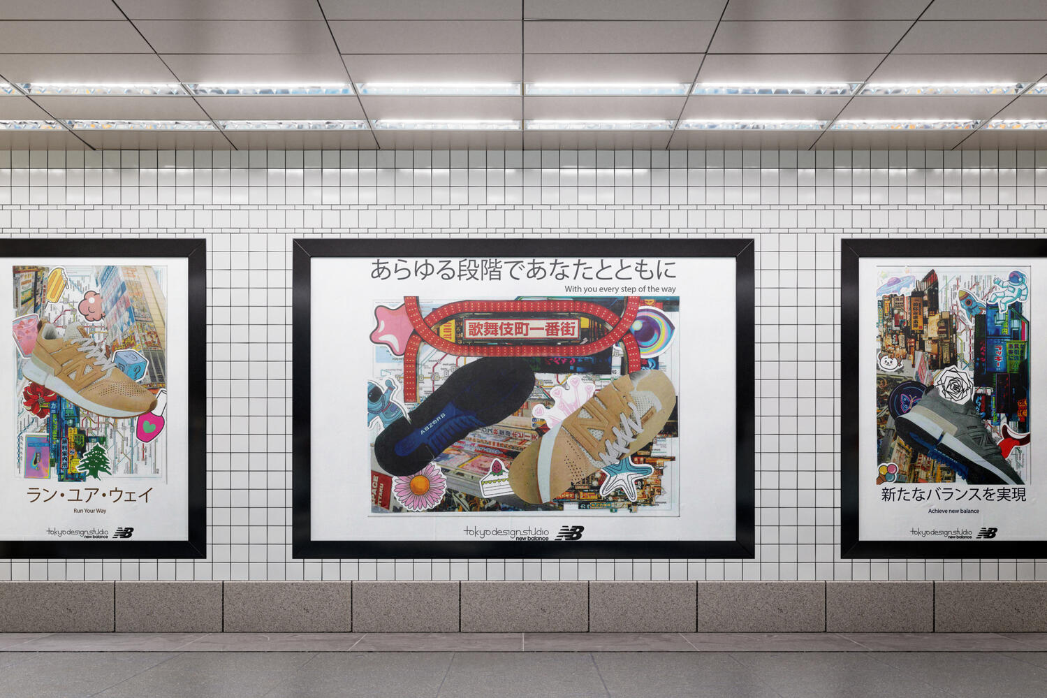
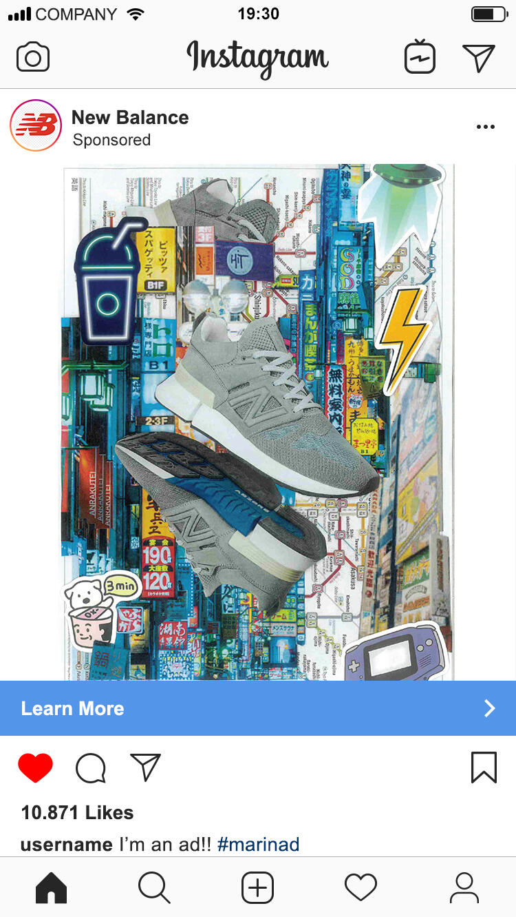
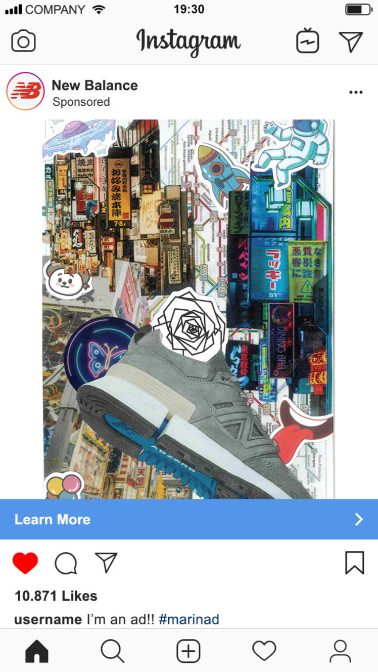
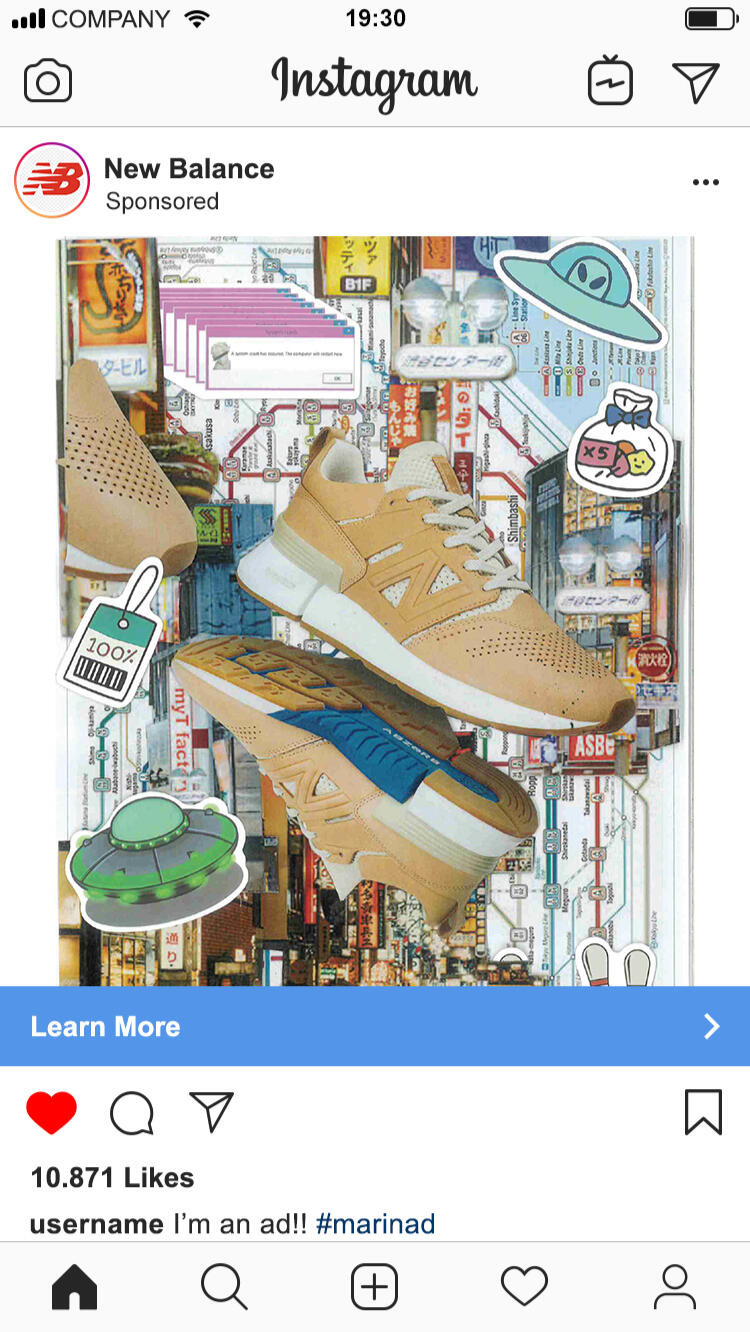
This project was a live brief module I had chosen to work on with a design director who originally worked with New Balance. My brief stated they wanted visual outcomes to promote their Tokyo Design Studio. This meant they wanted the use of Kanji and imagery to both sell their products and their studio.
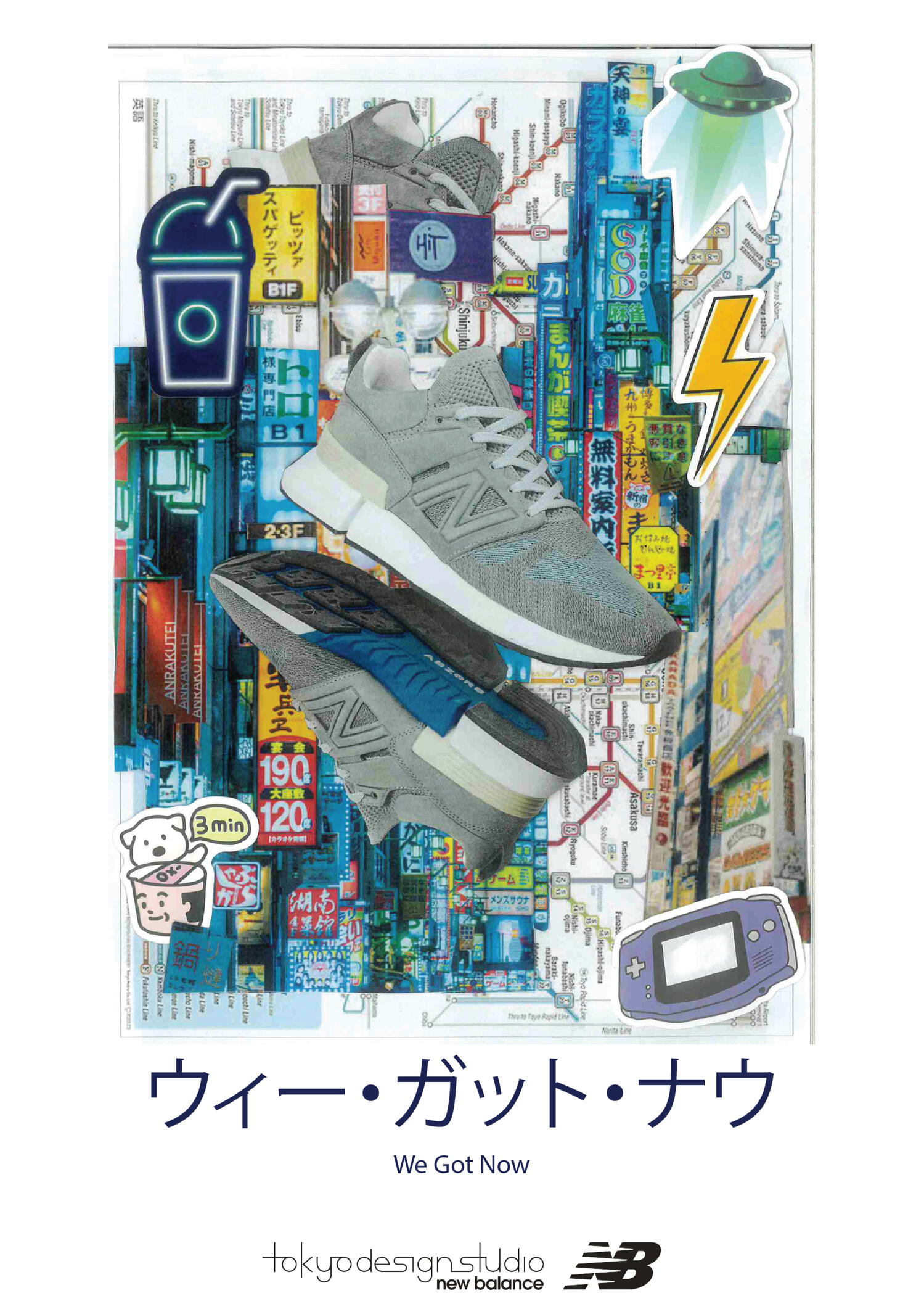
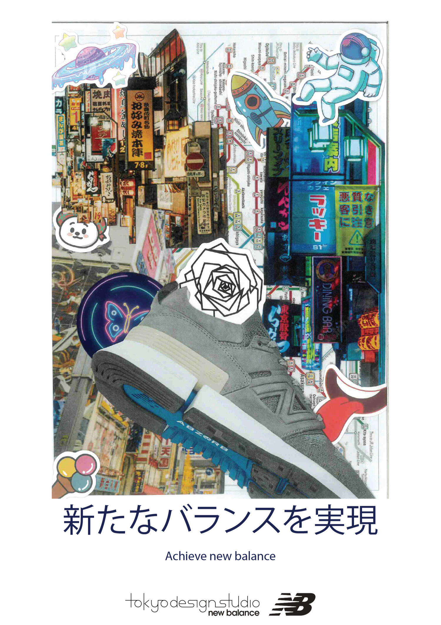
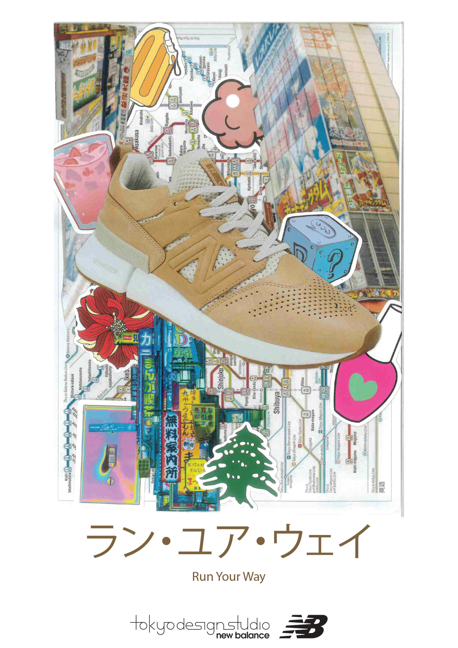
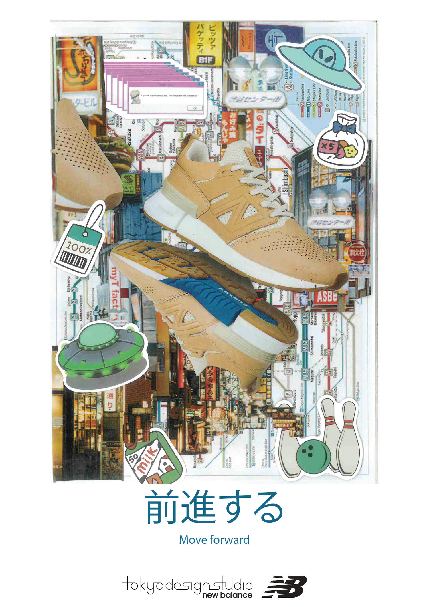
I was inspired by subcultures in Japan such as Gyaru and clothing of Sotsu-ran. These subcultures are seen as rebellious and against societal norms in Japan. Though these subcultures can be looked down on in Japan, what if I could take their patch work and love for community and spin it with New Balances branding.
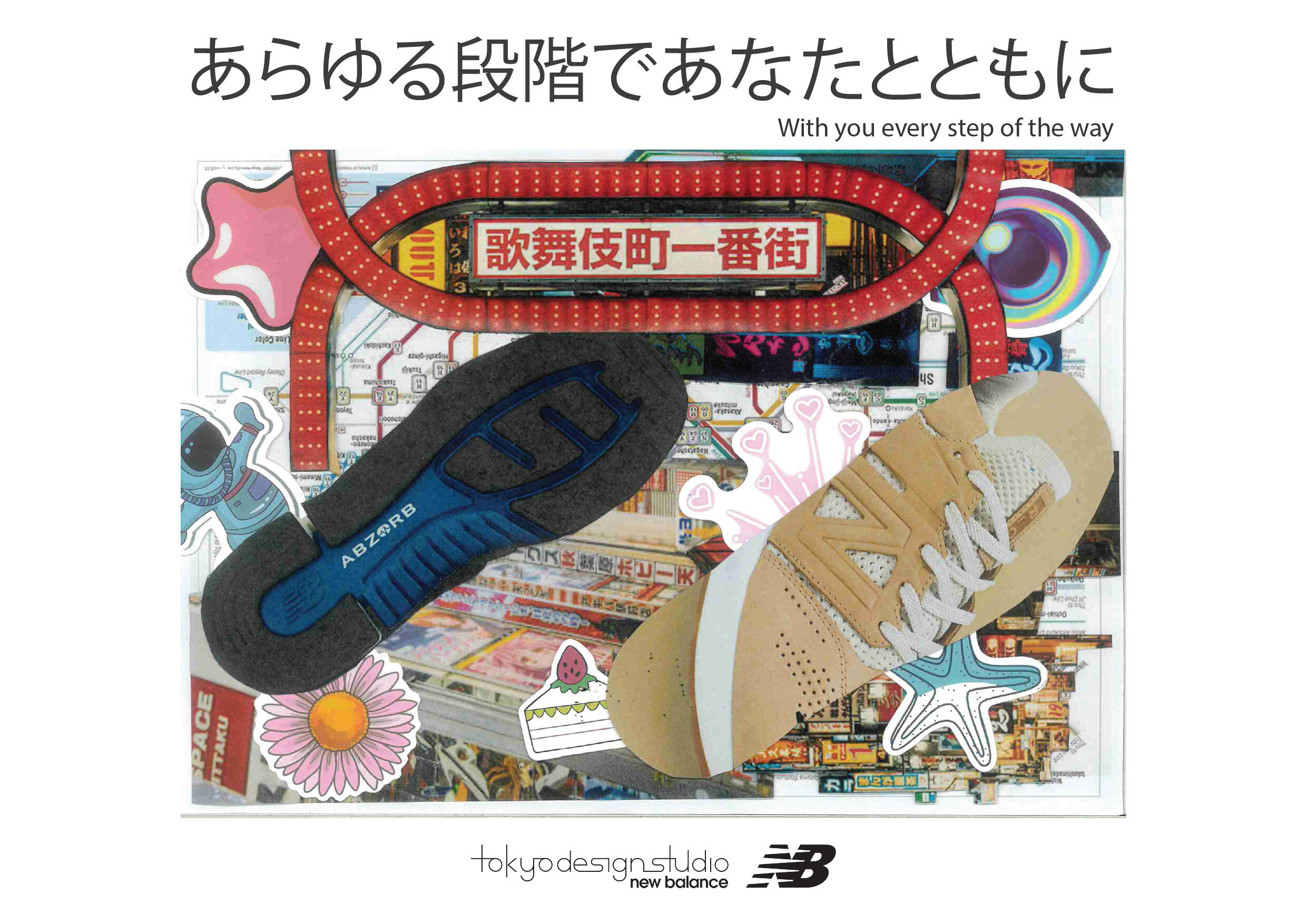
My biggest challenge was how to make my idea fit within New Balances guidelines. Their guidelines are all about simplicity and minimalism, therefore I was worried my idea was too hectic. However, though clear communication with the design director and working through the ideas, we knew these designs would be fresh and tell a story with the shoes.
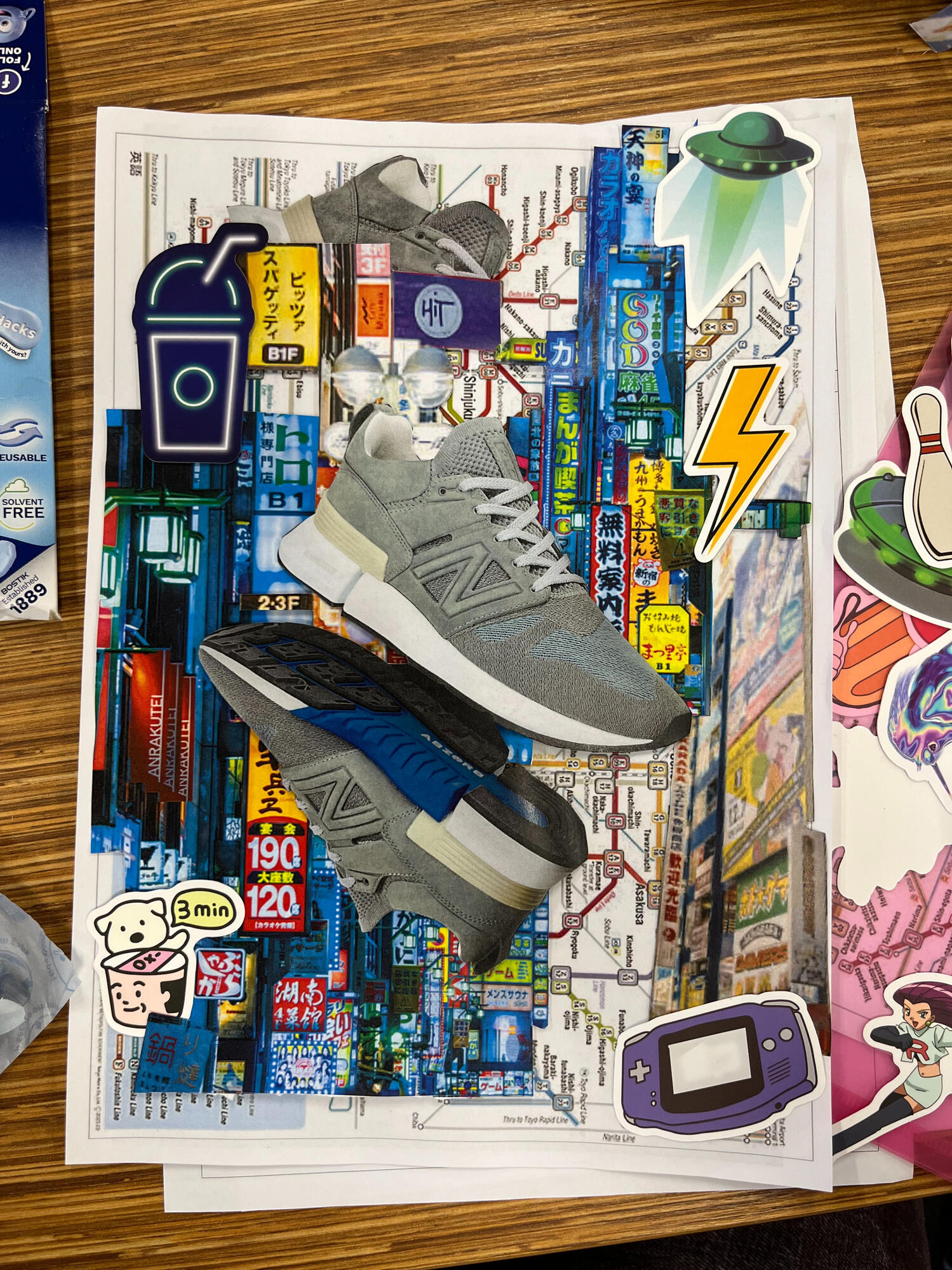
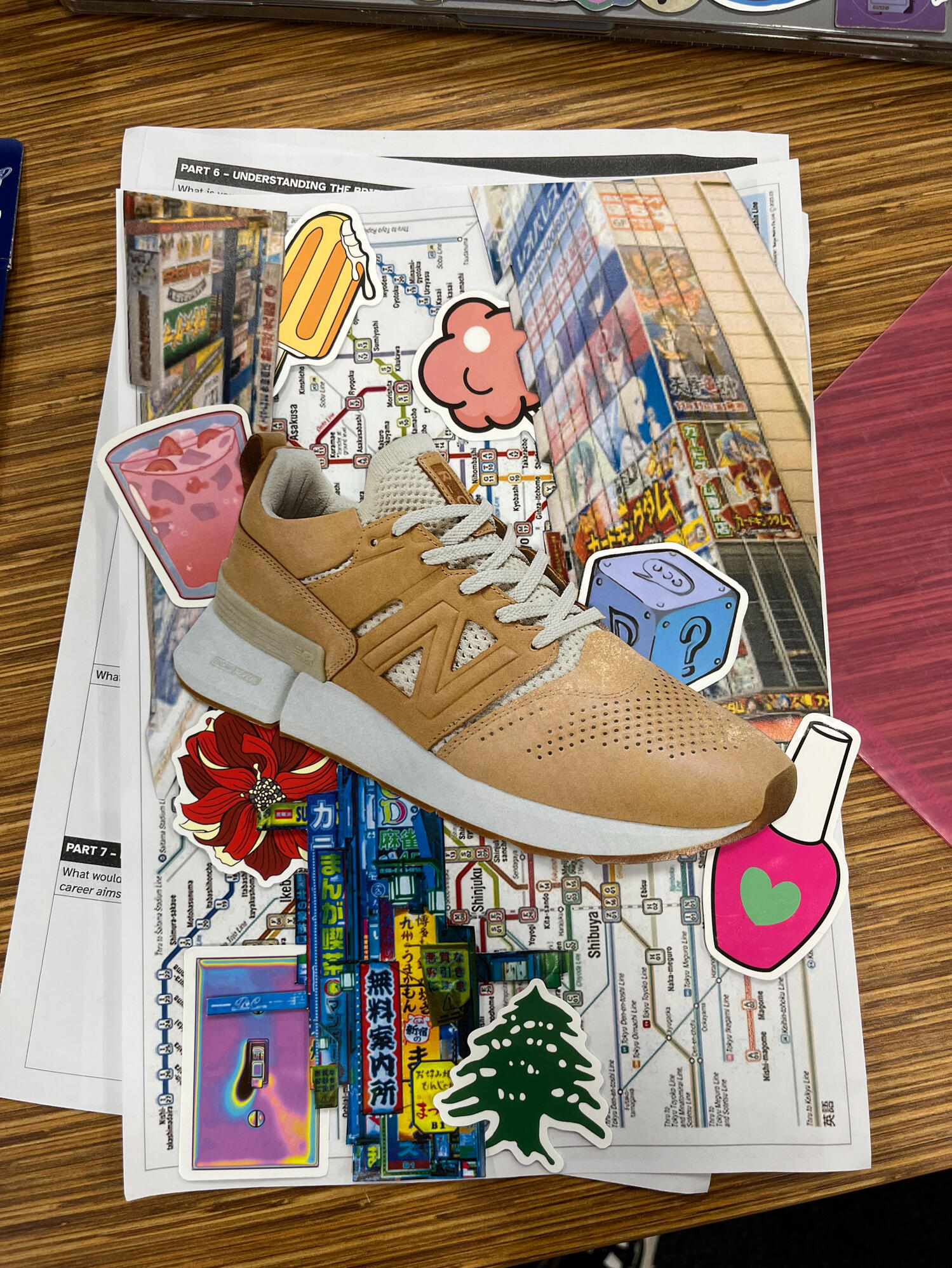
When designing the collages for the shoes, I used images of Tokyo night life, signage around Tokyo streets and I used the Tokyo railway map as a base for the collage. I also used stickers as a way to further add to the story of the shoes, that way it gives the design a personality to connect and speak to the audience.
Subversive Transcription 2023
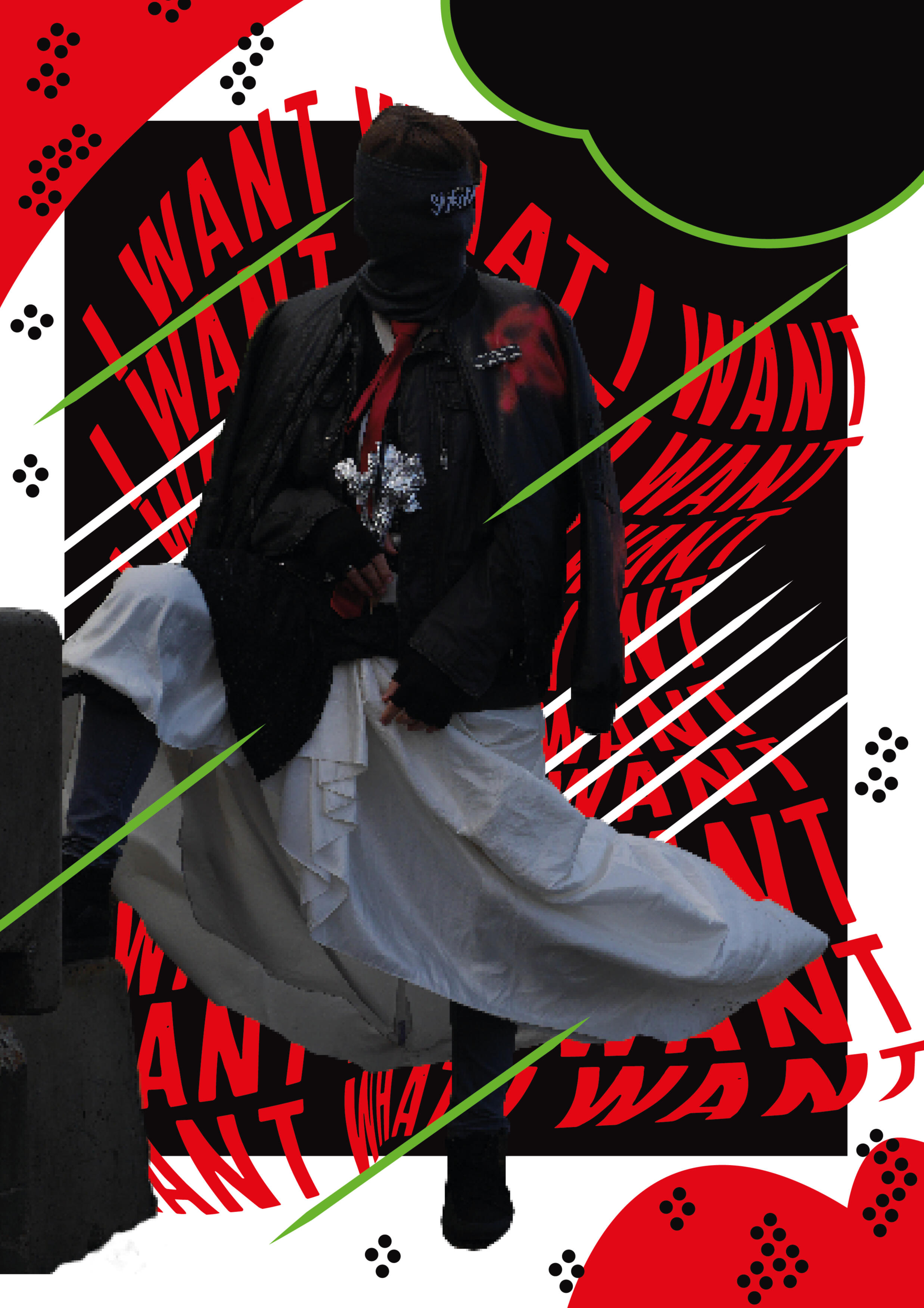
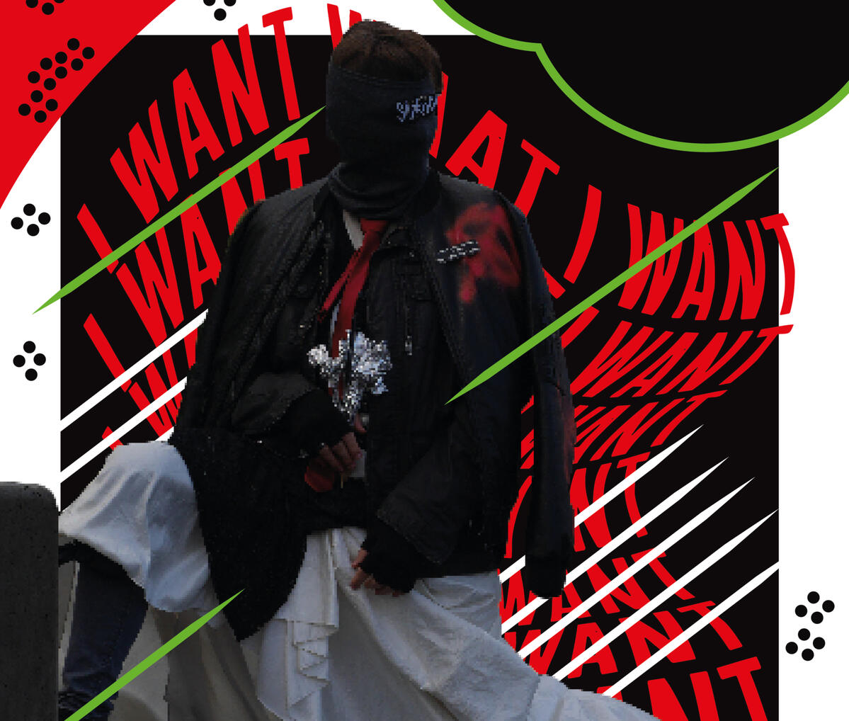
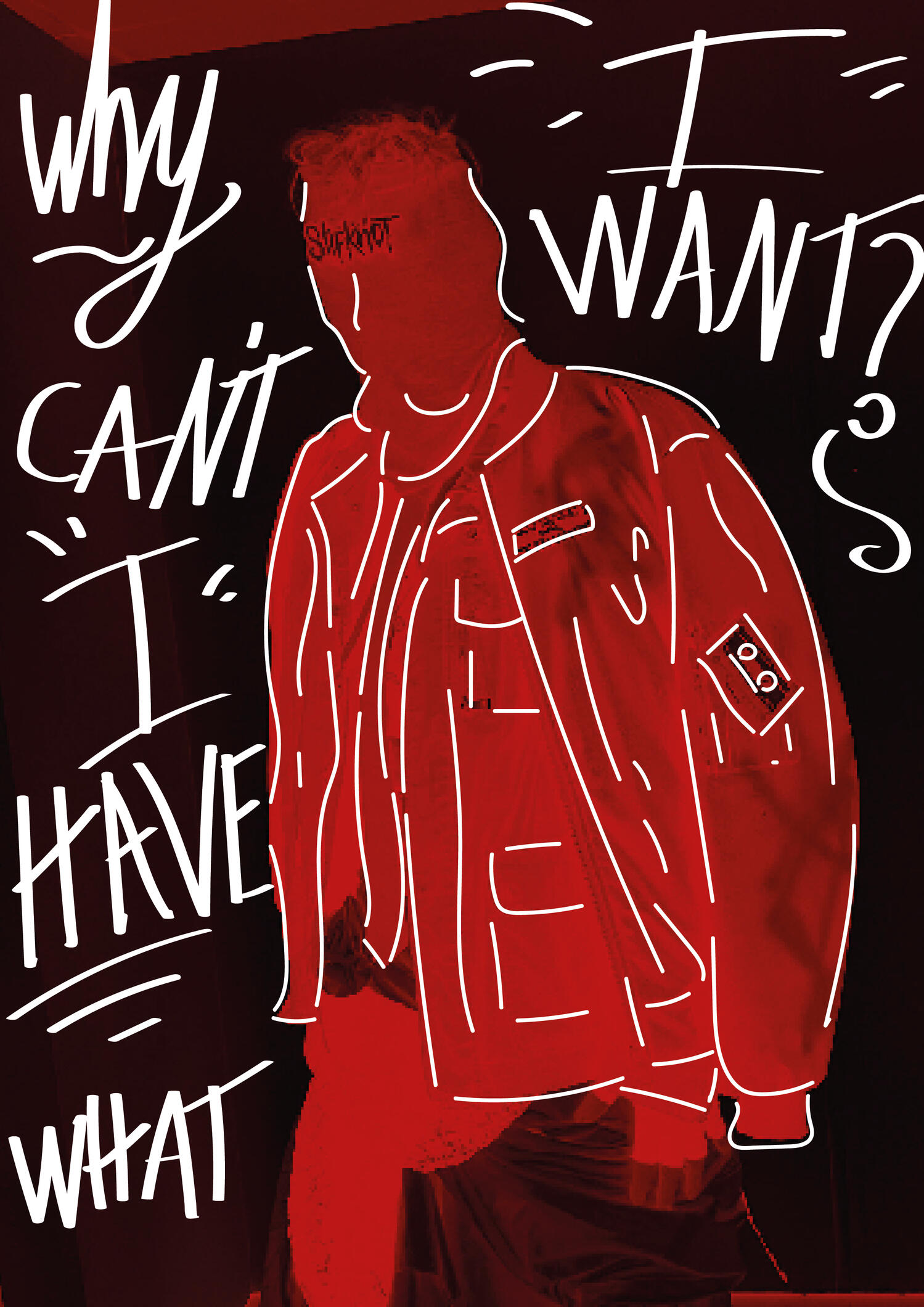
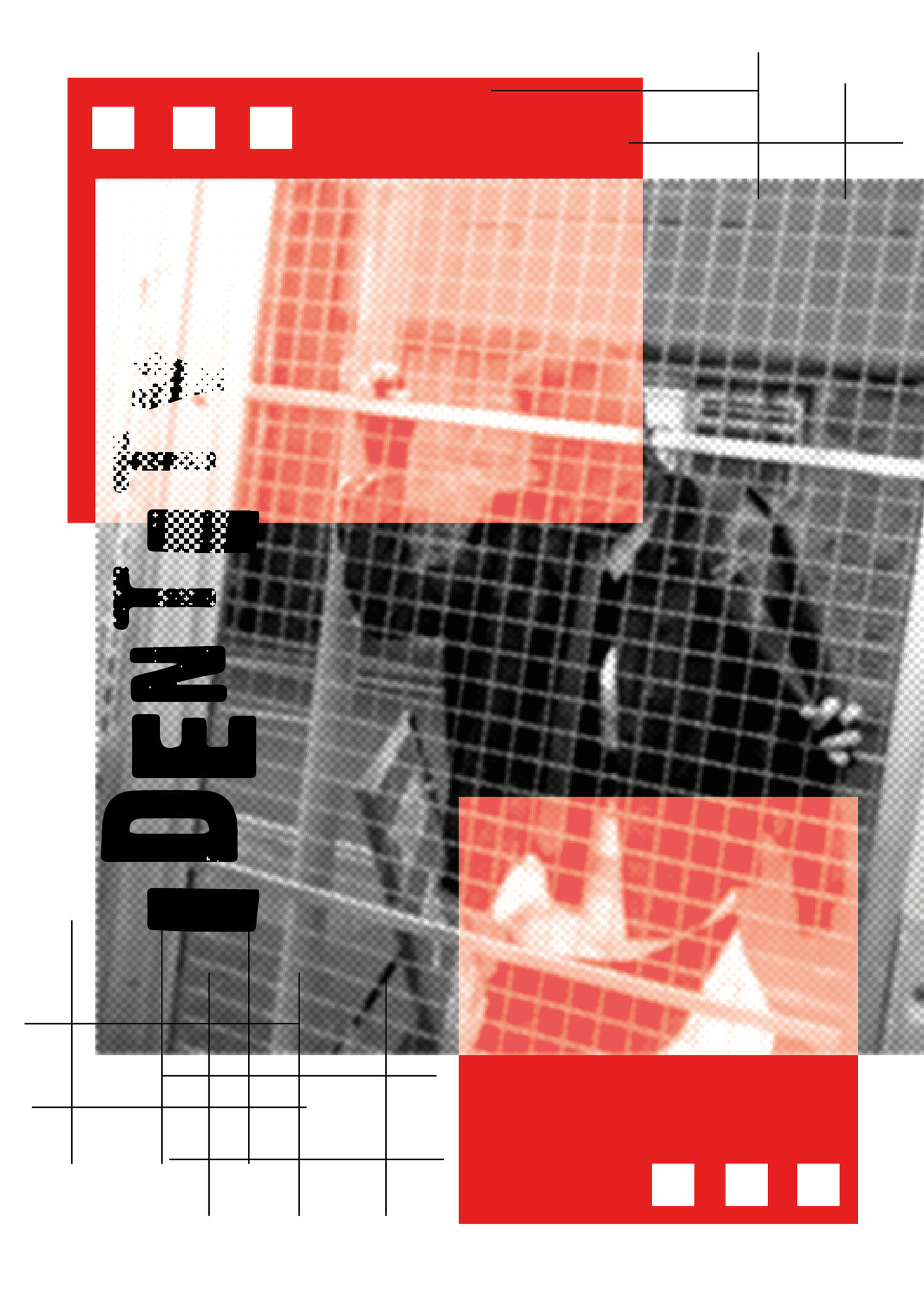
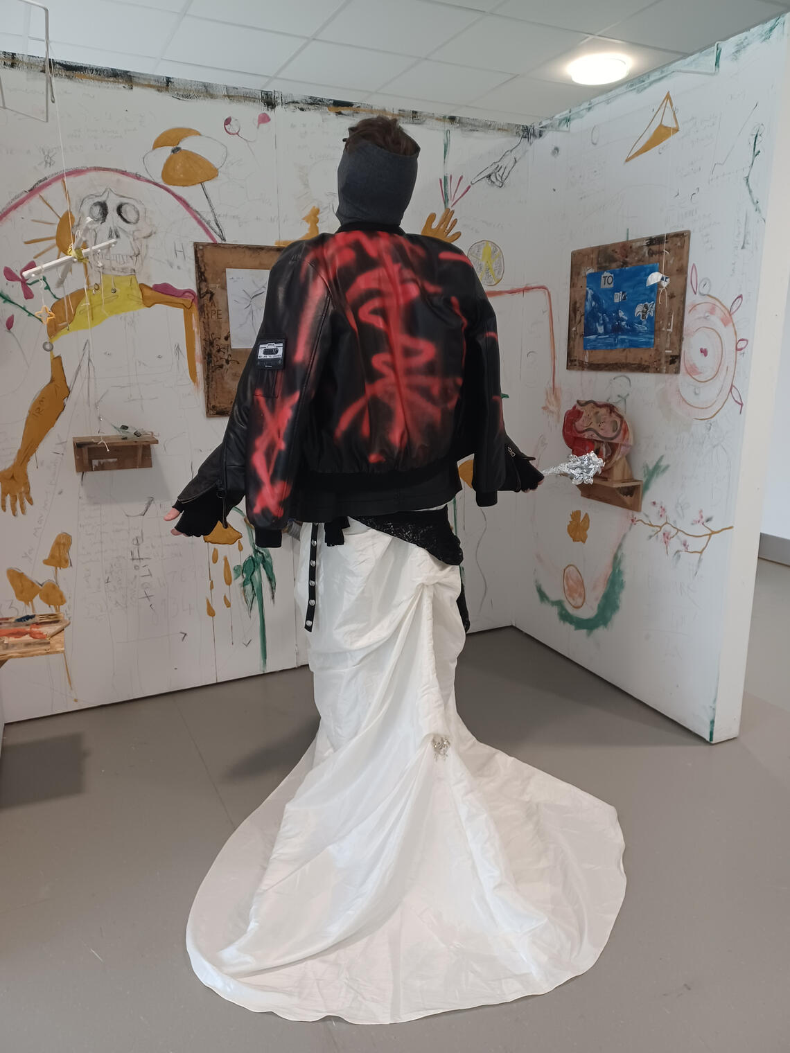
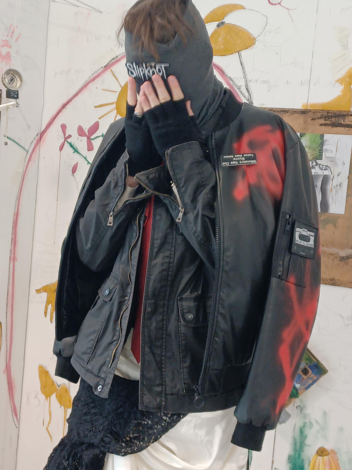
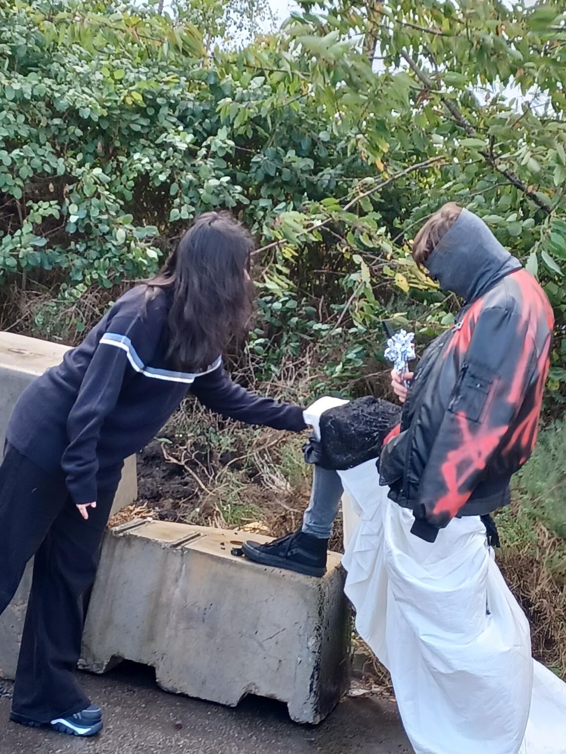
For this project, I had the chance to subvert a wedding dress and collaborate with my peers. We used a variety of cameras: phones, professional camera and even a 3Ds to take advantage of the blur to minimize editing. I also had the chance to produce fashion posters for the project. This helped me advance my skills in photoshop and composition. I took inspiration from an artist Yaroslav Lakovlev and their poster layout.
Seeing Metal 2026
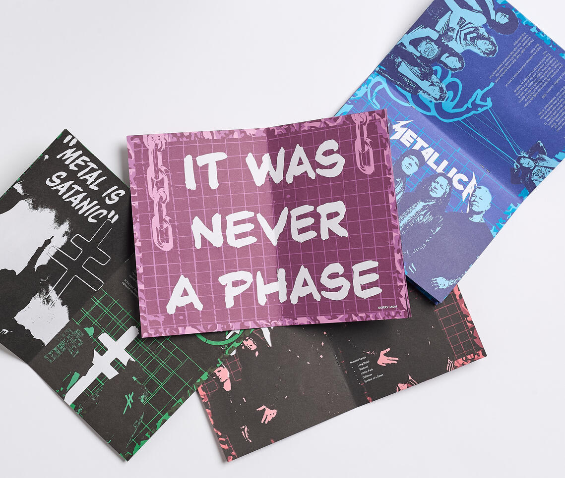
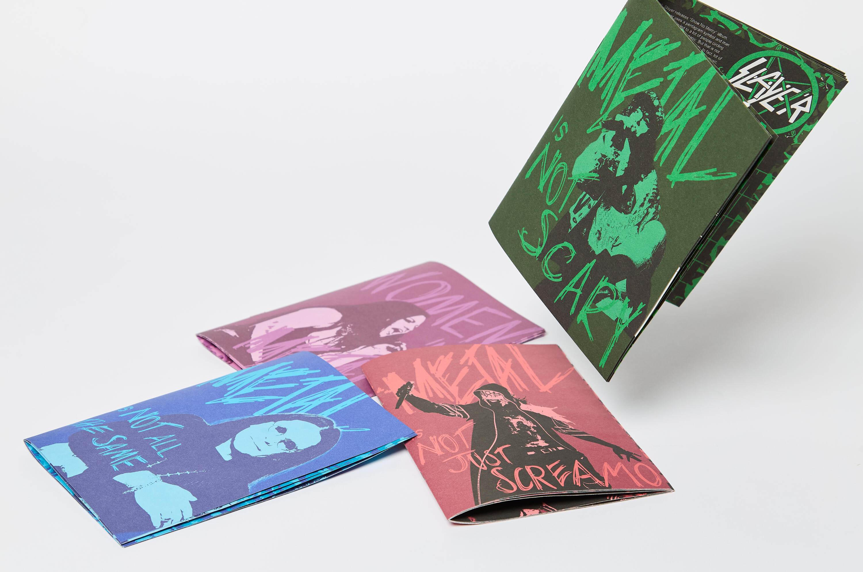
For my Final Major Project for my 3rd year at Portsmouth University, I perused my love for Metal music. The goal of this project was to address metal music stereotypes. To achieve this, I produced 4 zines each addressing stereotypes I have witnessed. This was mostly a love letter to my favourite music, bands, and the community.
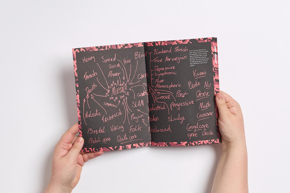
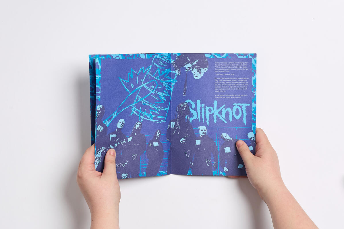
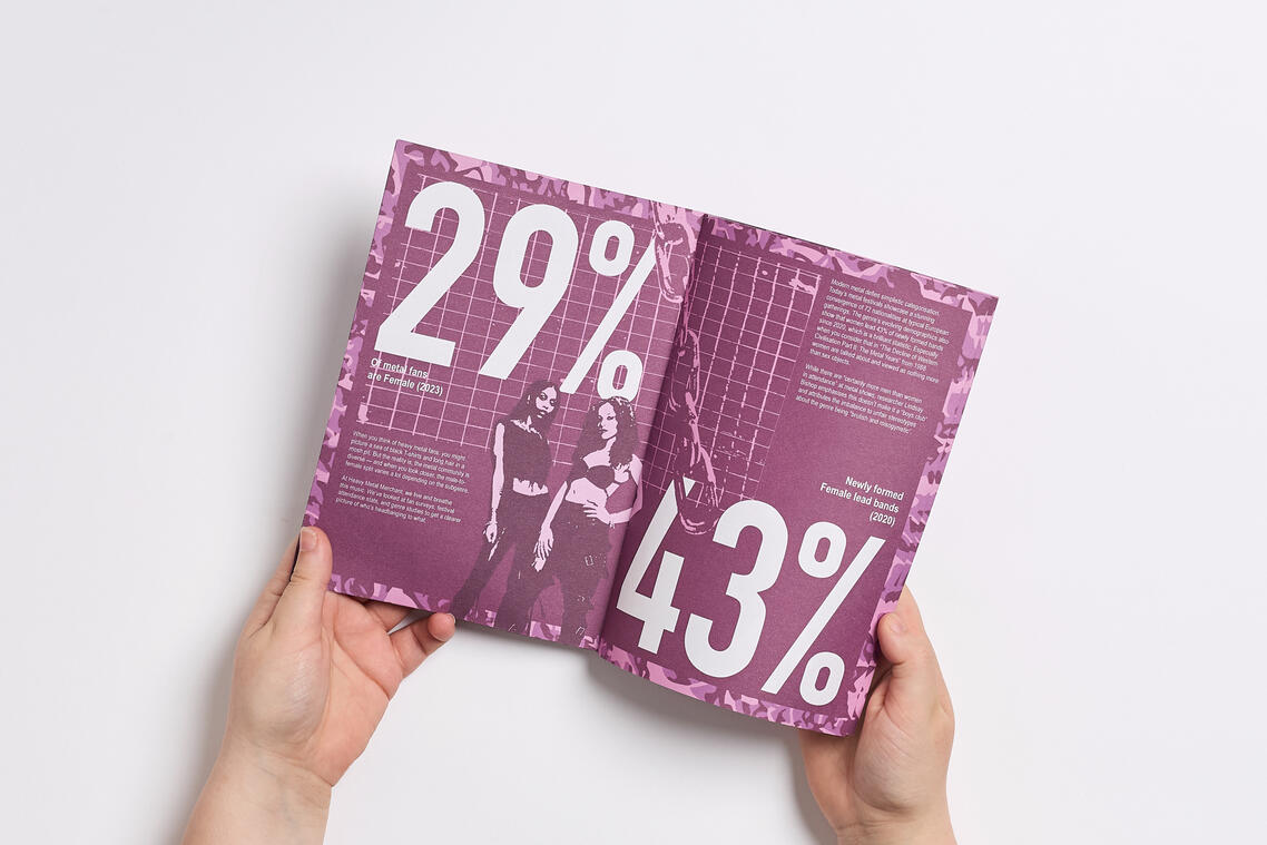
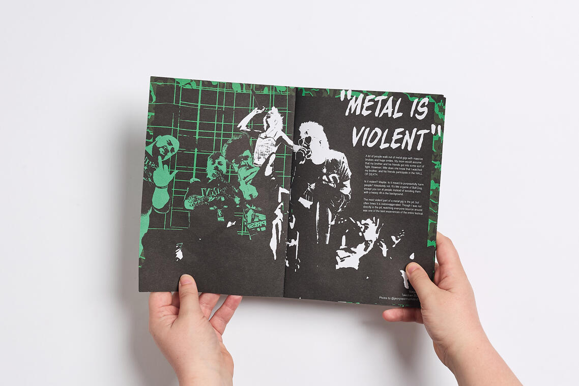
The strategy was to interview non-metal fans and gather their opinions of the genre. From these opinions and stereotypes I gathered, I created zines to tackle these assumptions. This would help introduce the metal genre to those who are looking to understand or start listening to the genre.
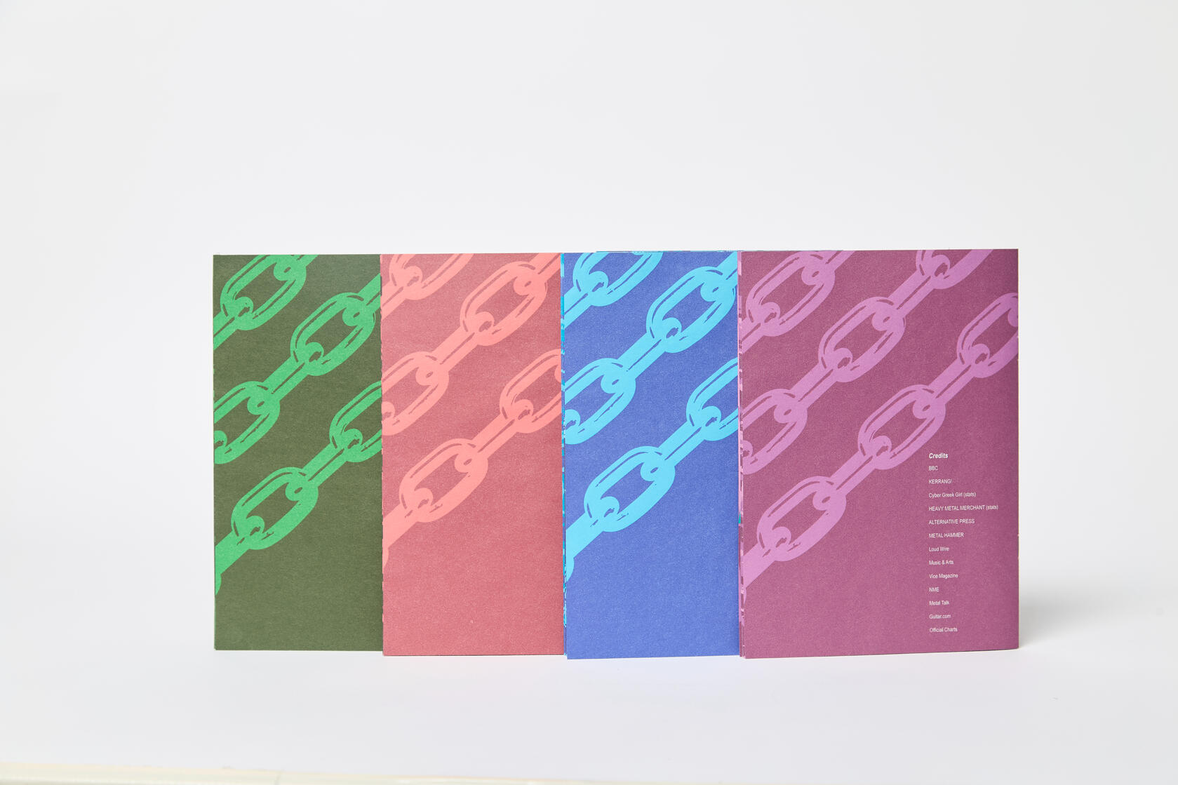
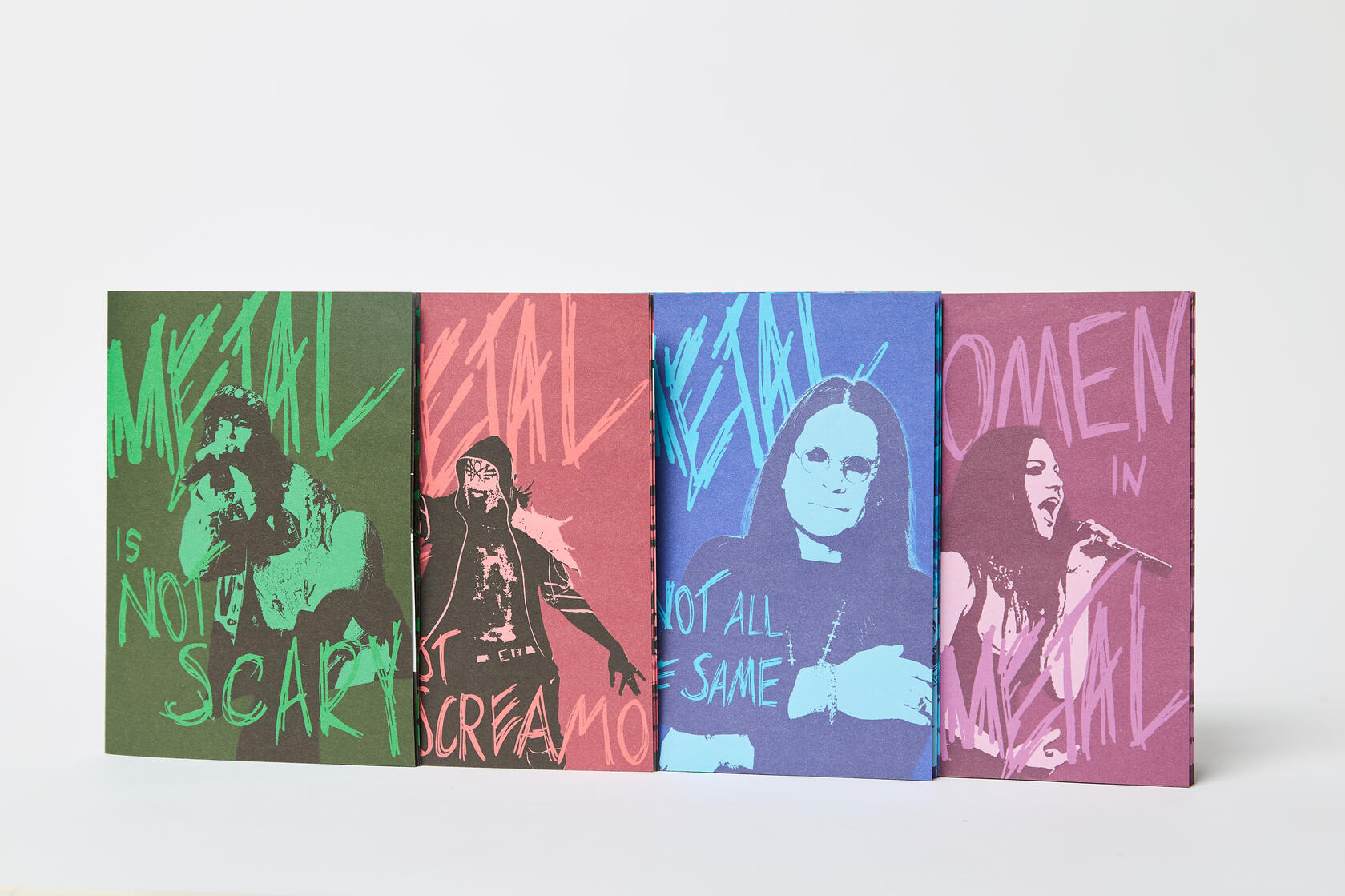
This was my first time producing zines, so I used my previous editorial skills that I learned from my previous university projects to make an enjoyable read for both metal and non-metal fans.
Dyson Challange 2025
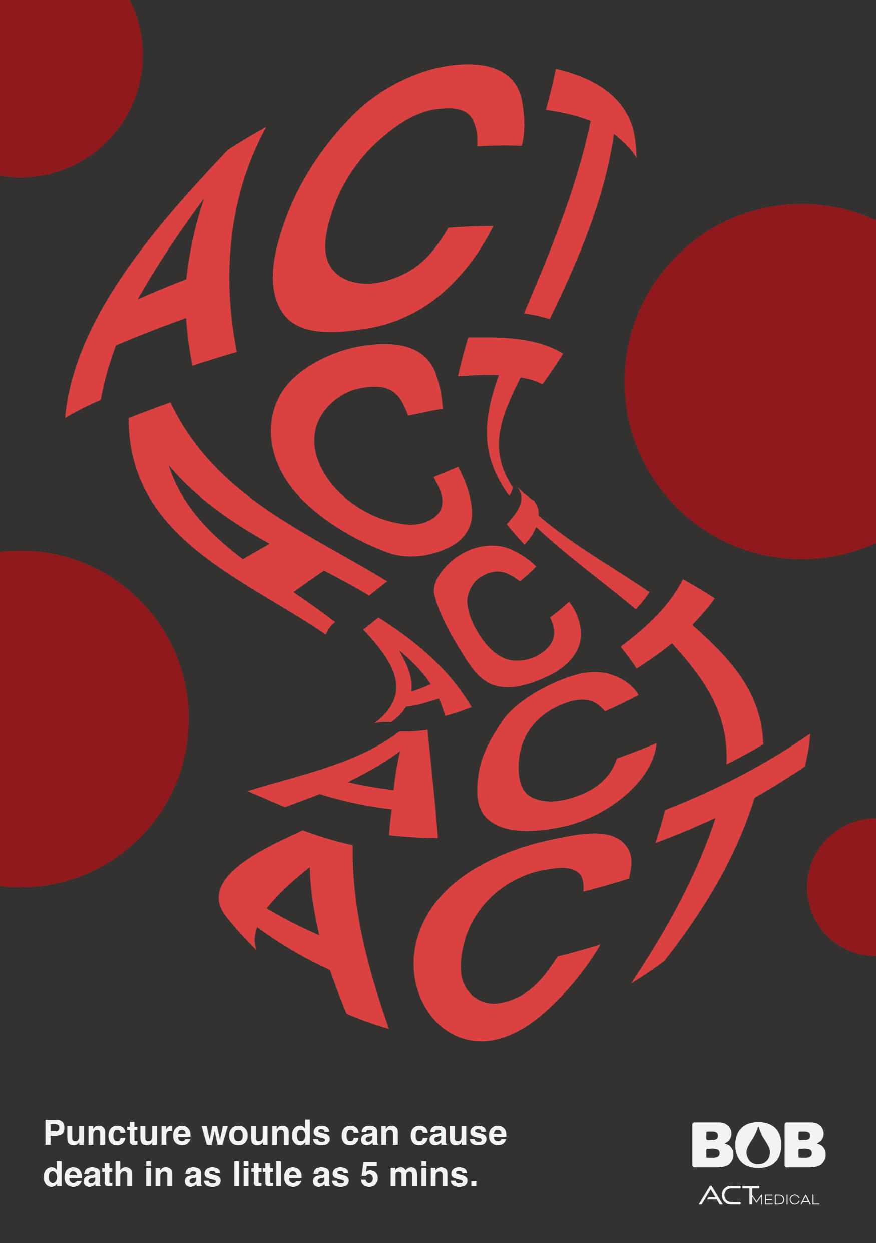
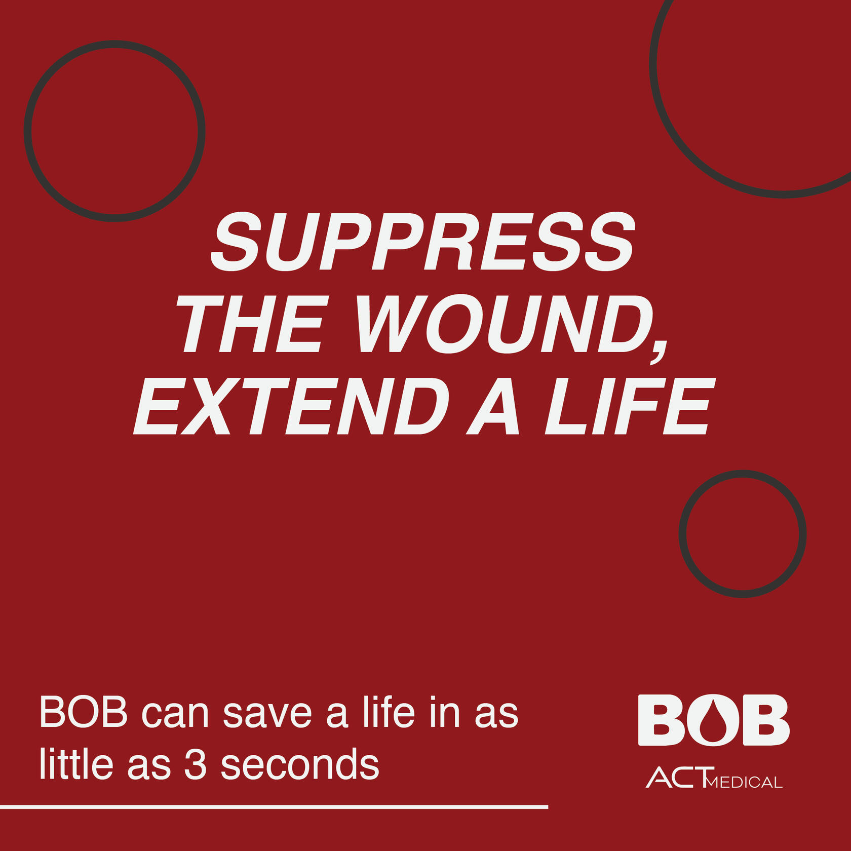
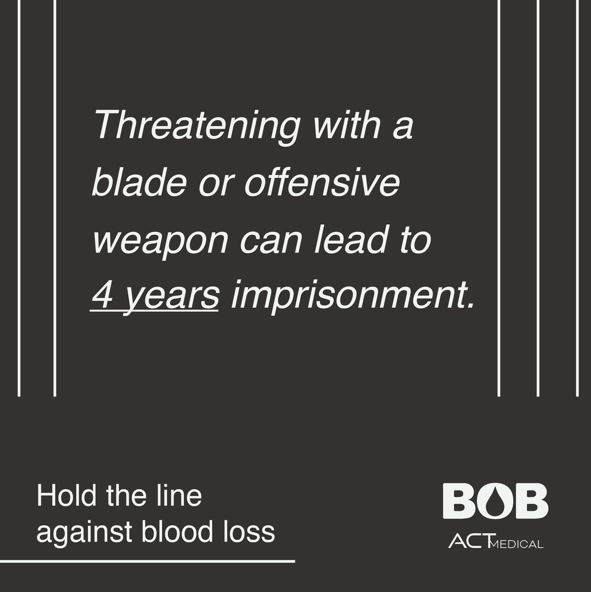
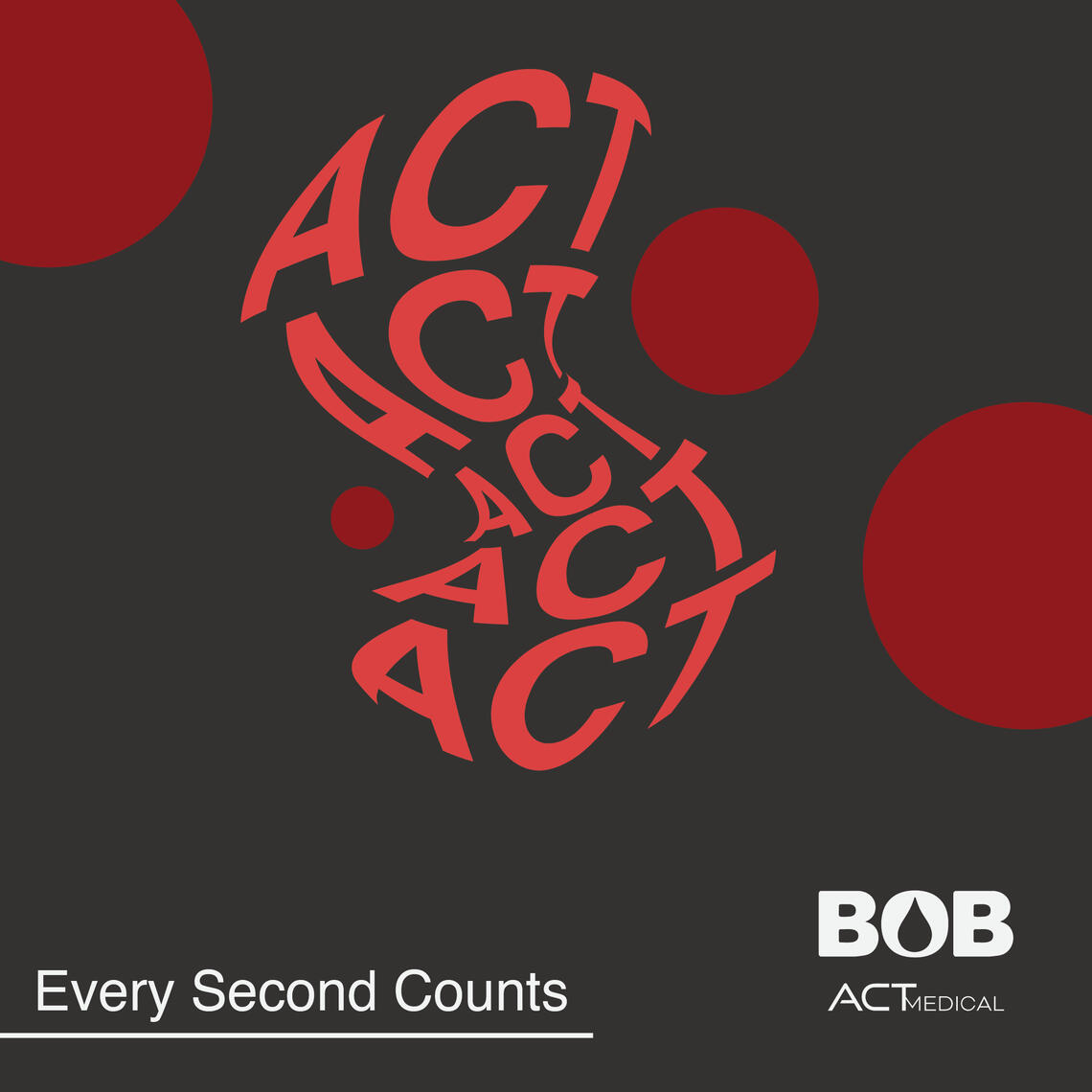
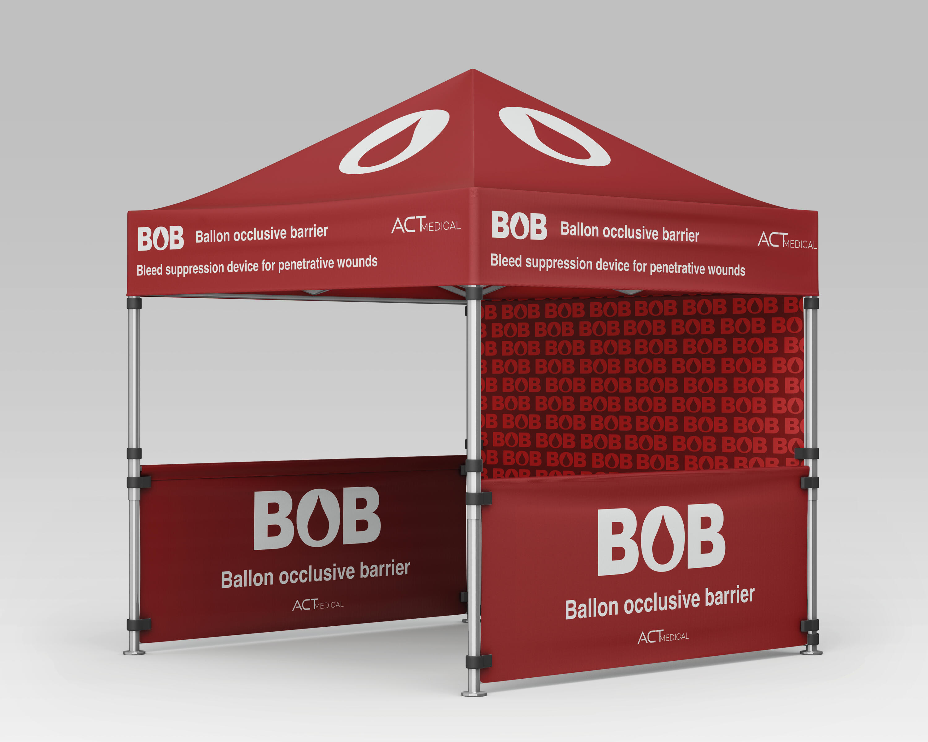
This is my second Dyson Challenge entry with my team as we were tasked to create branding for a bleed suppression device for penetrative wounds, which we called BOB. My team and I developed a Copy matrix, Logo, Packaging, Diagrams, and presented way of reaching our primary audiences.
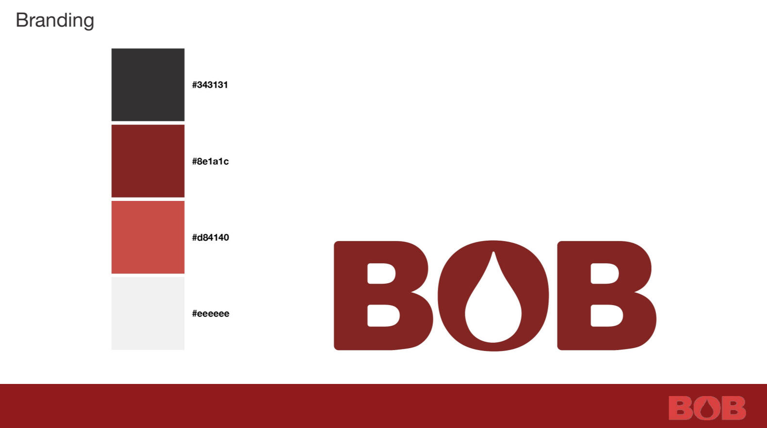
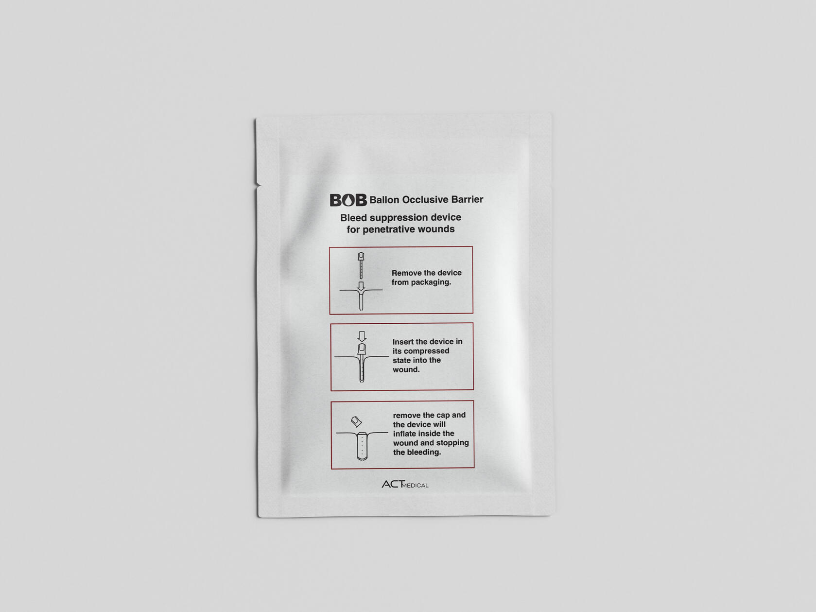
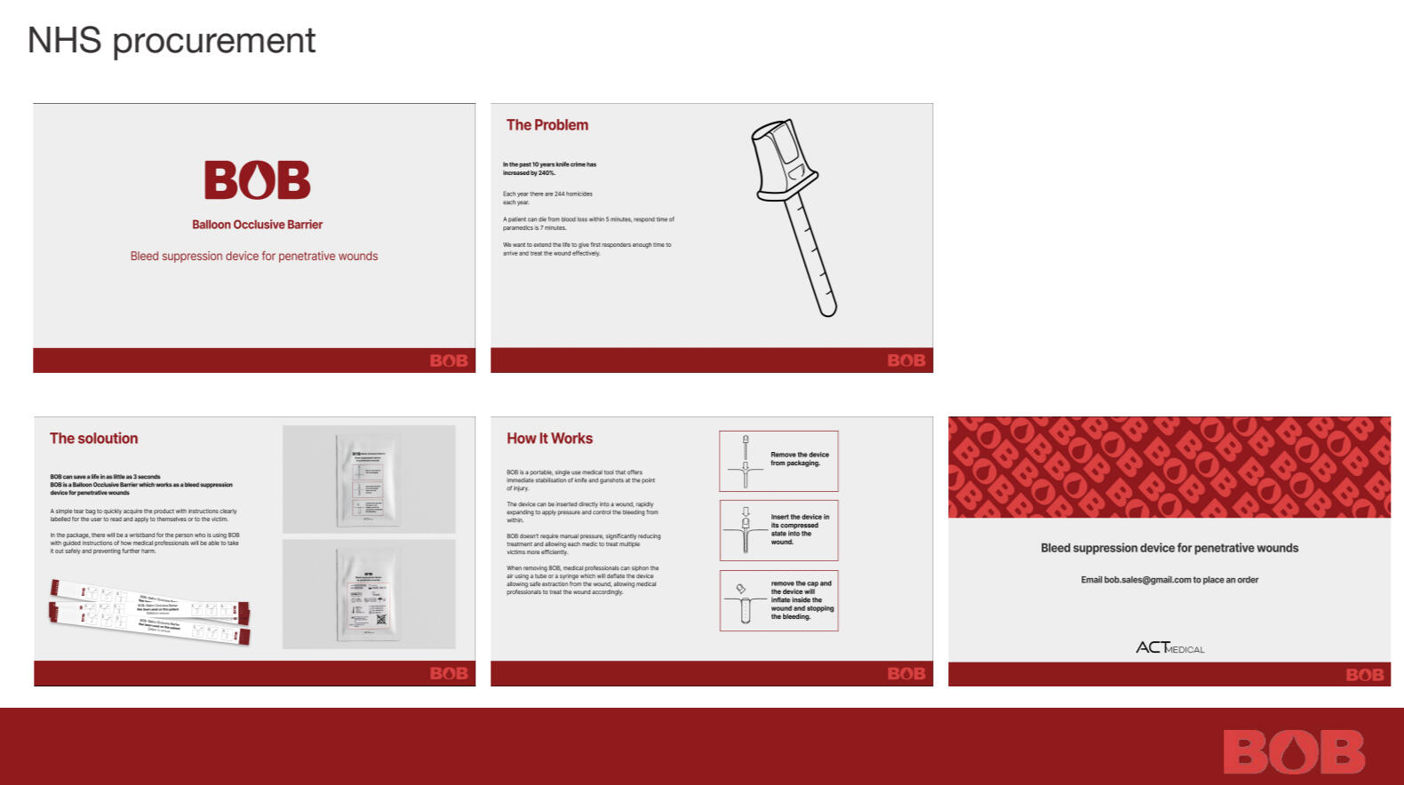
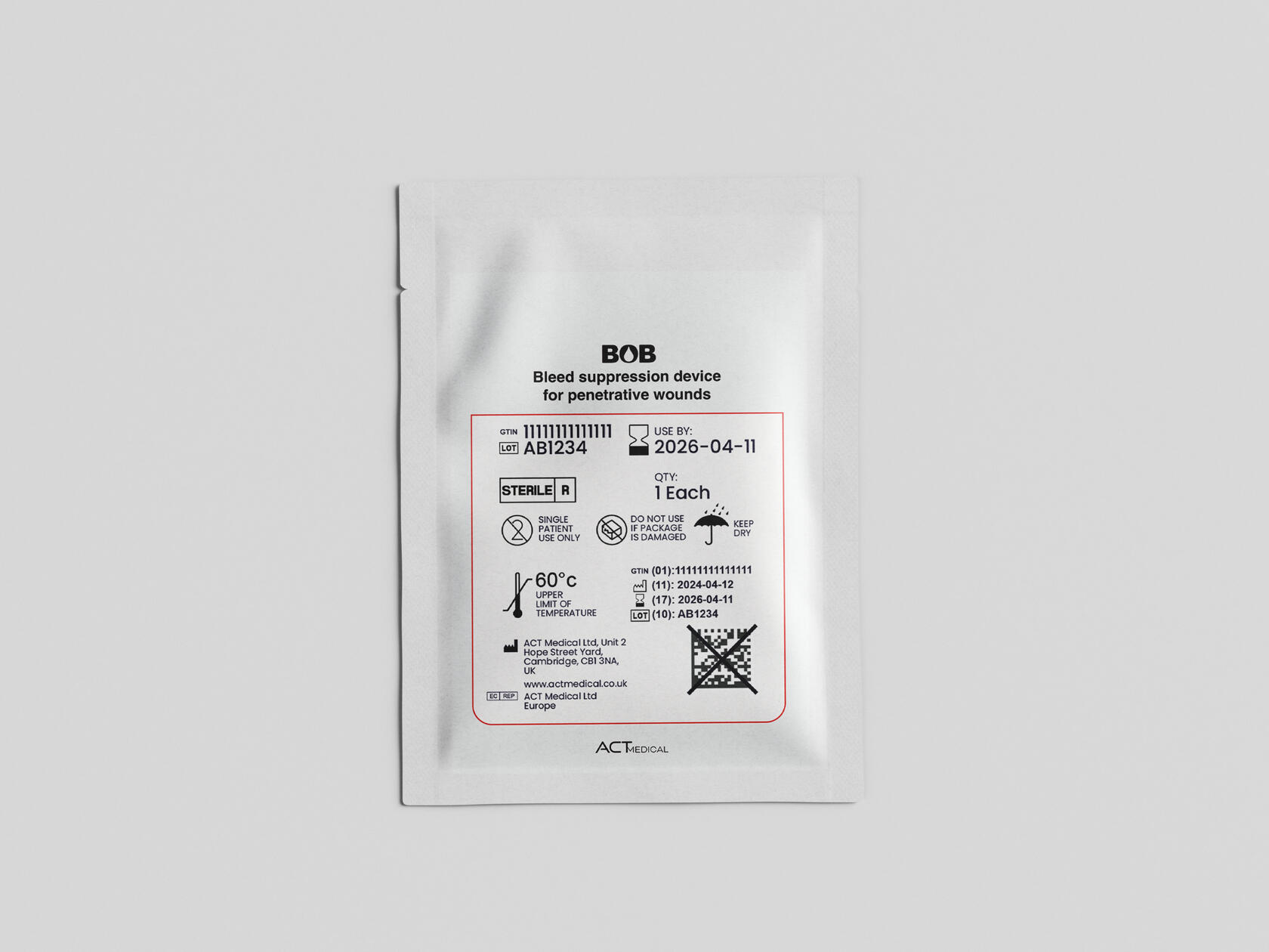
My task was to design the logo, promotional posters and posts for the campaign. As a team, we organised strategies for reaching audiences and displaying the effectiveness and awareness of the product. We used our communication and design skills to describe our strategies and key organisations to work with, such as the NHS and youth clubs.
True Metal 2026
This project was dedicated to my Visual Culture essay that discussed the symbolism used within metal music logos and in-depth dissection on why metal bands create illegible logos. To commemorate the typographic style, I attempted to crate my own versions of logos using non-metal musicians.
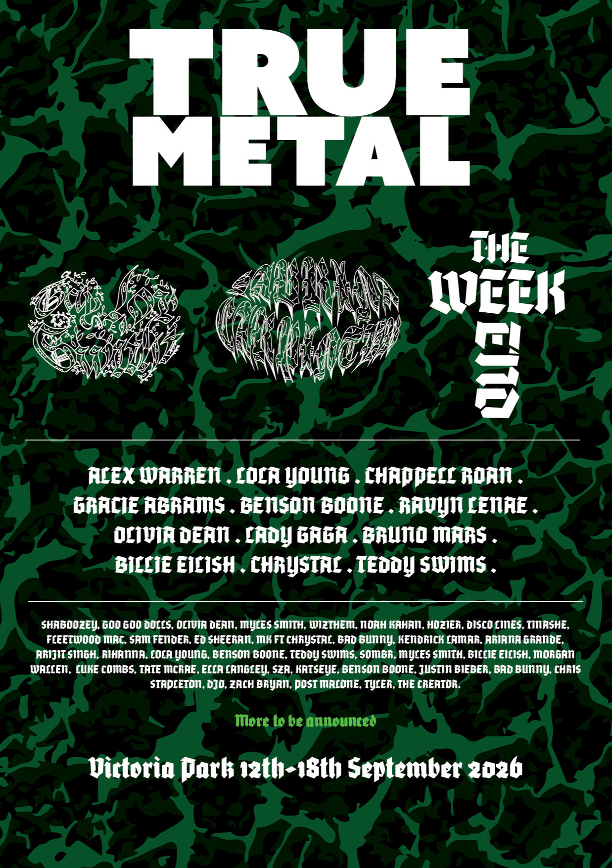
Creating the typographic logos was challenging and fun as the logo needed to represent the artist while also being illegible as possible. I used different styles of metal typography to best represent their music and then altered the shape of the text into shapes based off their albums and their themes.At the end of the project, I created a parody of a metal festival poster and displayed the log designs. In the future I should have spent more time on the layout of this poster, and I believe it did not bring justice to the logo deigns.
Brieley Hill Project 2024
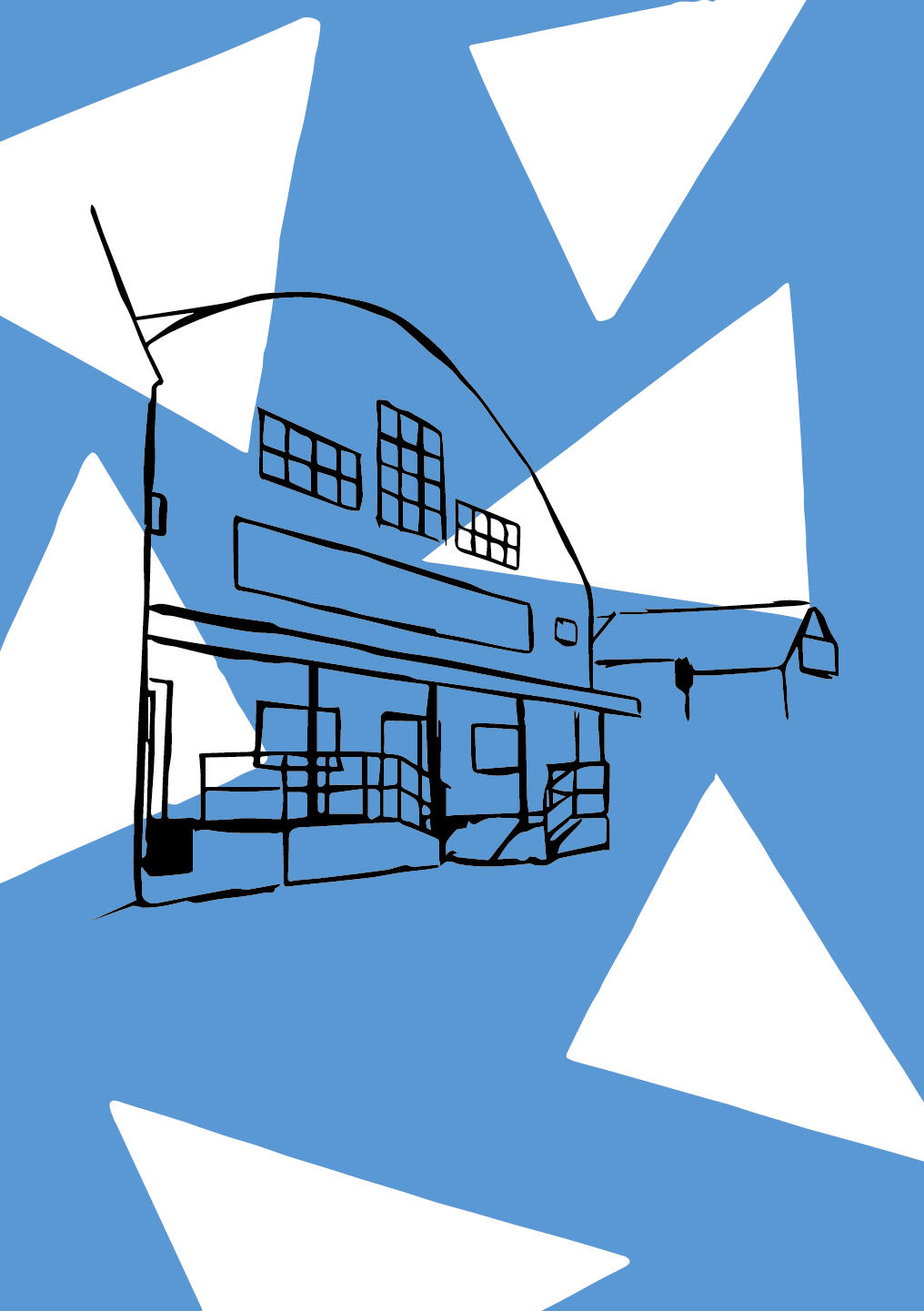
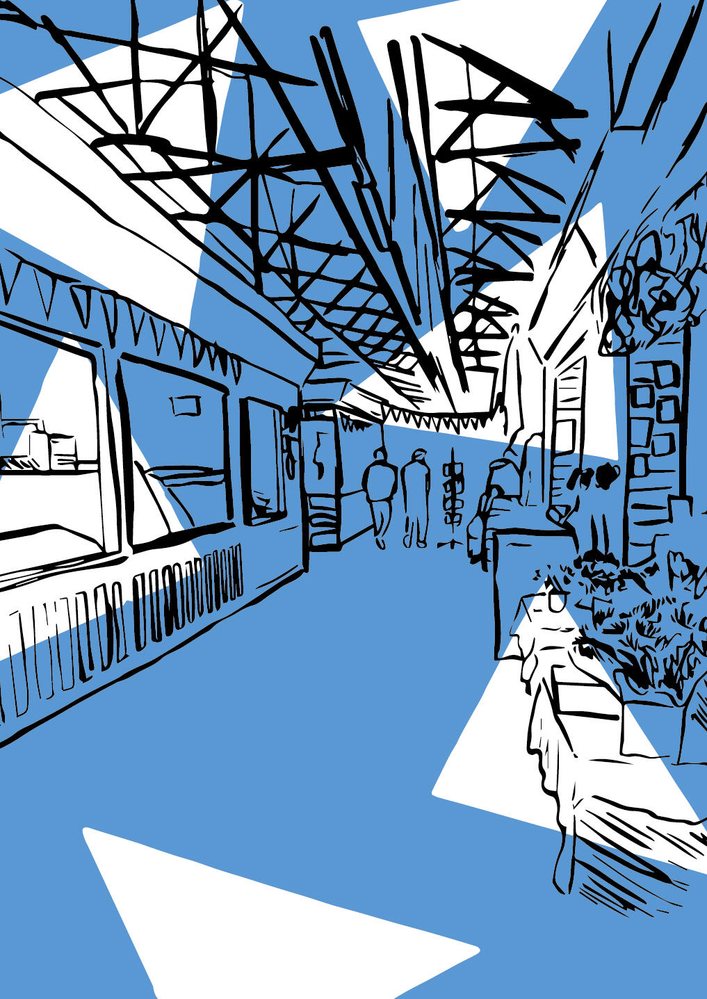
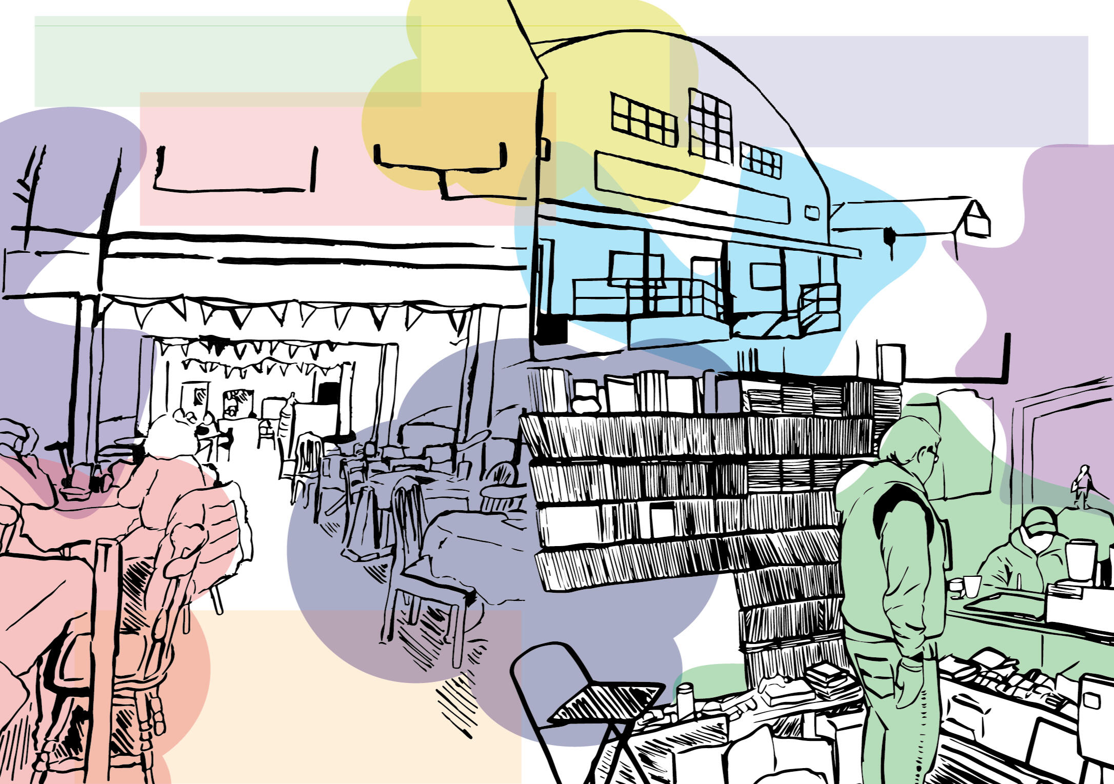
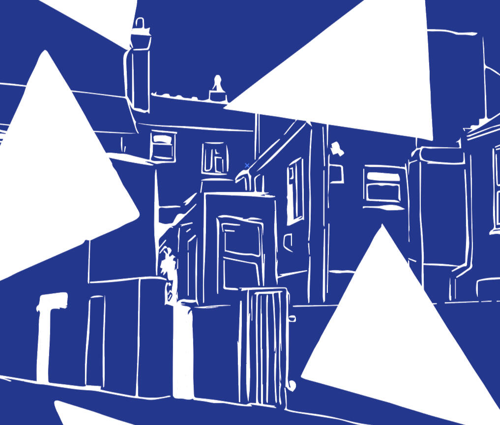
For this project, I had the chance to subvert a wedding dress and collaborate with my peers. We used a variety of cameras: phones, professional camera and even a 3Ds to take advantage of the blur to minimize editing. I also had the chance to produce fashion posters for the project. This helped me advance my skills in photoshop and composition. I took inspiration from an artist Yaroslav Lakovlev and their poster layout.